BACK TO DESIGN


AB tests & product detail pages: Deal promotion and sticky navigation
The business team was looking for opportunities to promote deals within a sticky navigation to follow page scrolling. I enjoy working with AB testing because it licenses ideation and explorations for innovative design, and recognizes impact.

ab-stickynav

ab-stickynav-detached


I found opportunities to apply existing responsive component designs to solution, including use of our colorful promo tiles for greater prominence and click-through rates on the flagging marketing banners (compare colorful version to colorless below). The product detail pages were not part of the RWD development effort, but the layouts were based on the same style and grid, so it made sense to encourage carry over.

ab-mktg_msg-3up_promo

ab-mktg_msg


Amongst several other approaches, I proposed floating carousels to accompany the deals widget.

View other promo explorations BROWSE PDF

ab-hover_carousel


Personalized accessory recommendations
A great collaboration, this business team would start with a strong premise and open up for variations to approach AB testing for personalized accessory recommendations based on most popular devices (unauthorized users) and customer-specific devices (authenticated). Variations included personalized marquees and features on the landing page, followed by list pages with personalized device and accessory filters.

ab-marquee

ab-devices

ab-filters

ab-popup


Product detail pages: Collapsable tables and scannable iconography
Contributed to several aspects of product detail page redesign, used for devices and accessories. Created layouts in alignment with our responsive grid and reduced sprawling device details to collapsable, scannable tables.

pdp-details

pdp-specs

pdp-inthebox


Google Adwords
An early AB test exploration seeking to bring prominence to the CTA. A major problem has been many requirements for showing legal text, the page below being the condition of the site when we were approached to solution.

View layout variations. BROWSE PDF


ab-googleadwords


Analysis: Capone VS Citi online credit card payment
Received a request for comparison of online transaction experiences. I immediately thought of the contrast between my experiences in paying my two credit cards online, and detailed why CapitalOne provides the cleaner, more effortless experience and feeling.
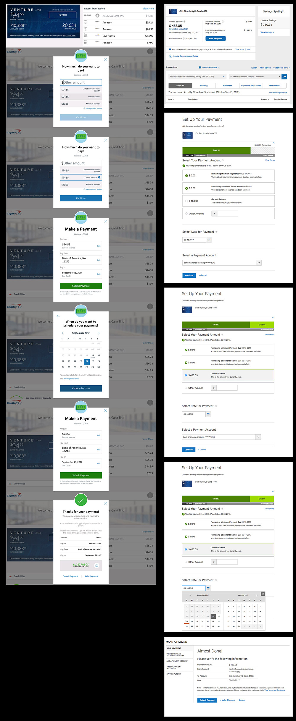
CapitalOne:
  • Payment flow contained in a short, narrow modal with dimmed background
  • Flow progresses through one consistent screen format
  • Information relating to payment is focused and concise, minimal verbiage
  • Use of color / bold typography further emphasizes action, separates / focuses information
  • Icons/color offer visual cues / indicators, feels intentional, like an app unto itself vs an auto-generated form
  • Minimal calendar, compare with wider Citi version: The Citi calendar affords next month without additional click, but minimal is better overall
  • Noticeably painless, simple, bold and colorful
  • Sections posed in the form of a question, use of plain language
Compare verbiage: Capone vs Citi How much do you want to pay? vs Select your payment amount: a guiding question inviting user to identify from multiple choice vs select which is a rigid and burdensome

Make a payment vs Setup your payment: make connotes immediacy vs setup sounds like you might want to bring a lunch

Citi:
  • Long scrolling, disconnected parts, feels like an auto-generated form
  • Reads as busy, text-driven, sprawling, nothing commands attention
  • Minimal use of color for any purpose – emphasis or esthetics, and a nasty variation on green
  • Header is thin font, separated from action
  • Wider format accommodates more text
  • A lot to read, small text, harder to read, white backgrounds
  • Confirmation screen changes format
  • Possibly offers some additional info but overall feels busy
capitalone_vs_citi


Back to Design